Impact:
- Strong NPS score, addressing users’ pain points
- Broader range of content
- Reduction in time to find desired content
- Fostering an educative environment for live coding/debugging
1. The Hook ("Why")
The Problem:
Coding is often a solitary, high-stress activity. Despite being one of the most collaborative industries, the act of writing code often happens in isolation - headphones on, world tuned out, the browser as your only companion.
The Current State:
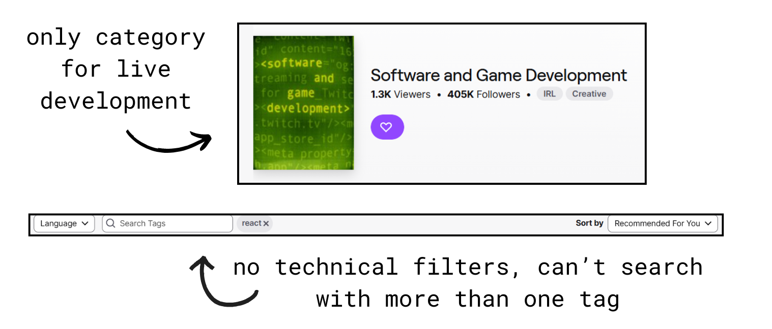
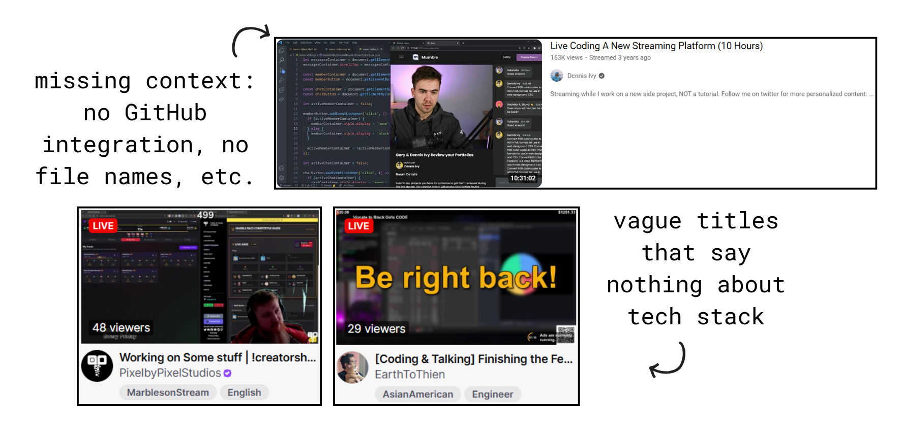
While Twitch exists for gaming, "Live-Coding" on existing platforms feels like an afterthought. Current tools lack the UI developers need to discover technical stacks, debug together, and feel a sense of shared "flow" state.
⚠️When developers do stream on platforms like Twitch or YouTube, the experience is designed for entertainment, not education:
2. The Vision ("What")
The Mission:
Create a streaming platform where:- Discovery is instant: Find "Rust + Bug Fixing + Advanced" in 3 clicks
- Context is automatic: See the GitHub repo, current file, and last commit before clicking
- Community is built-in: Chat that encourages questions, not spam
- Learning is the goal: Every design decision optimizes for education, not virality
In short: Build a cohesive and engaging, "code-first" ecosystem with a scalable design system that prioritizes technical metadata to reduce "Time-to-Content" for developers.
3. User Research ("Who")
After conducting 15 interviews and observing 8 users attempting to find coding streams on Twitch, three different personas emerged: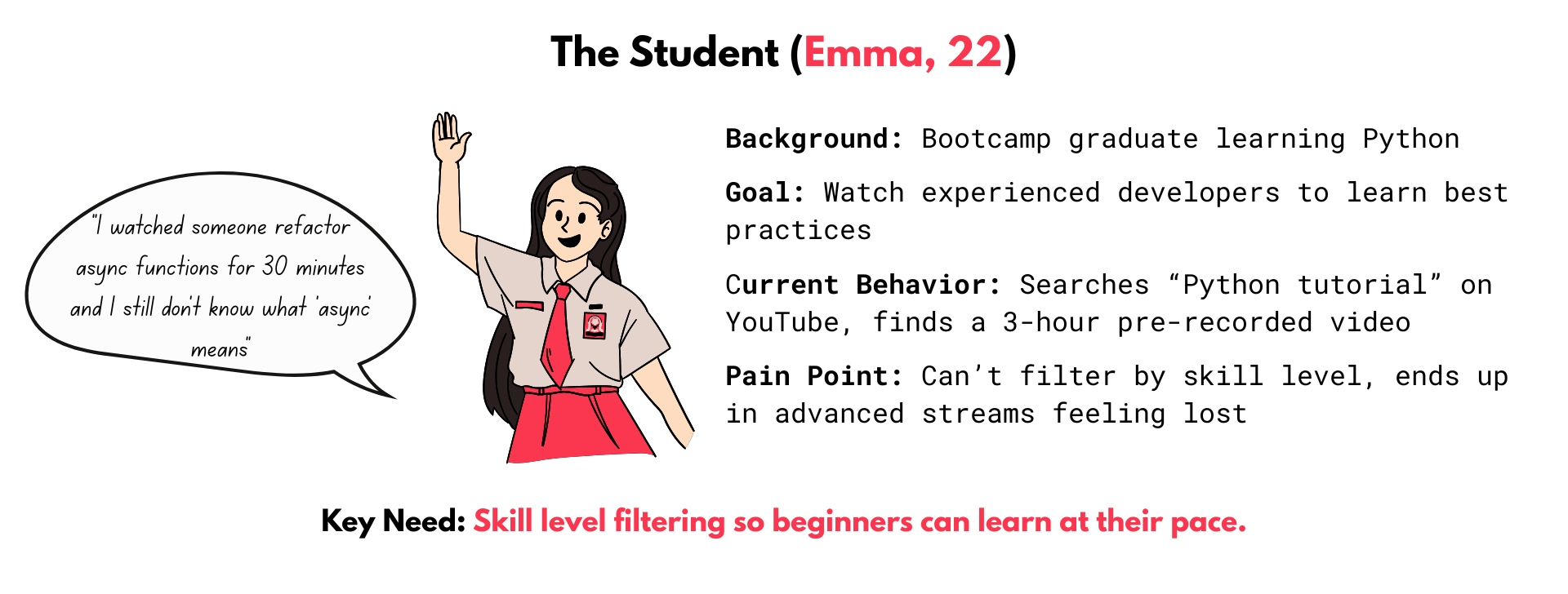
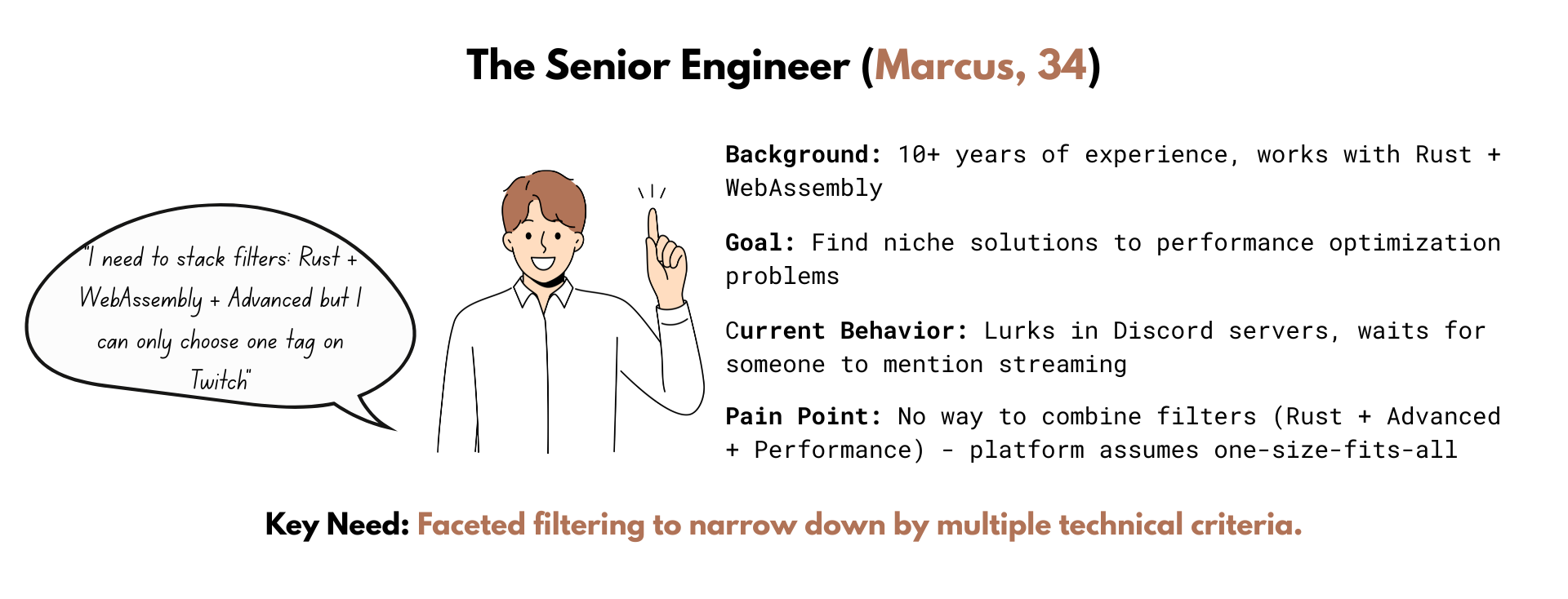
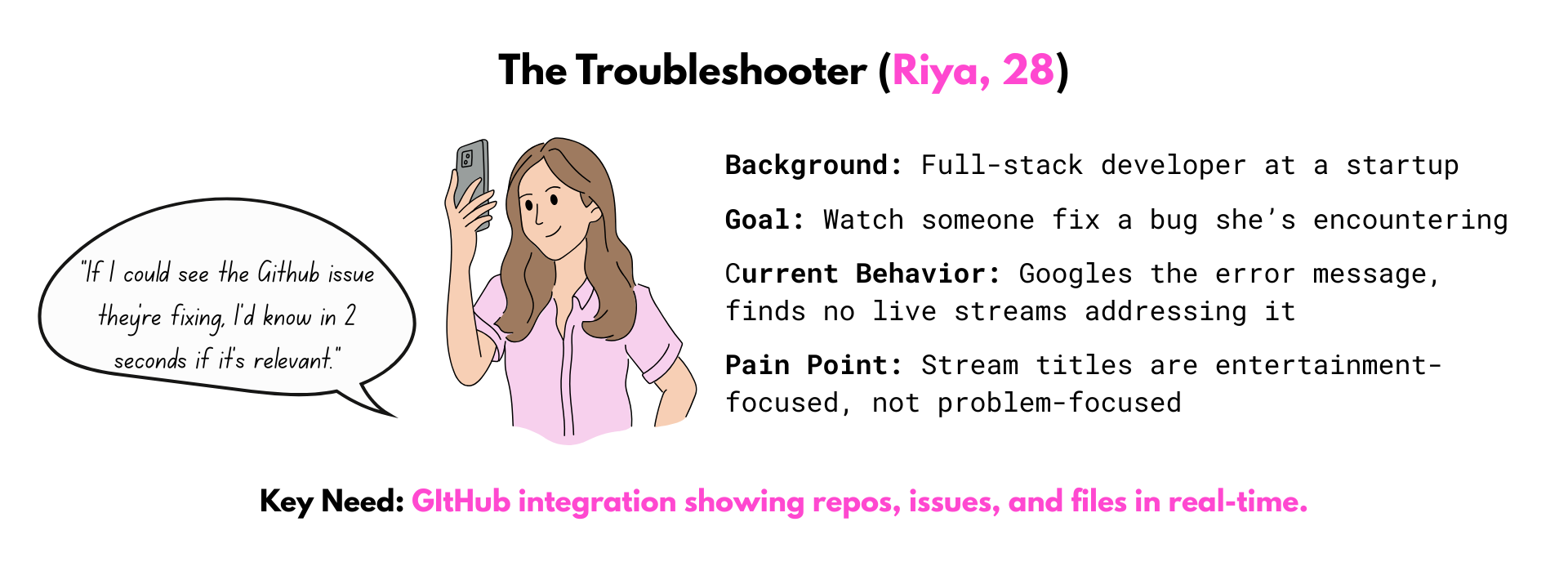
The Unifying Insight:
⭐All three personas shared a deeper need beneath the surface pain points:"I don't want to watch coding. I want to feel like I'm coding with someone."
4. Design Principles ("How")
Three core principles guided the design process:
- Language tags are bold and gradient-colored (impossible to miss)
- GitHub repos use monospace font (instant recognition)
- Activity states use semantic colors (orange = bug fixing, green = building)
- No unnecessary animations or visual noise

- Bug Fixing -> Show GitHub issue number prominently
- Building Feature -> Emphasize repo link and branch name
- Code Review -> Display PR number and file diffs
- Learning -> Highlight tutorial resources

- All buttons follow the same padding rules (12px vertical, 20 px horizontal)
- All cards use the same border radius (16-20px)
- All tags follow the same hierarchy (Language -> Framework -> Level -> Activity)
- Spacing follows a strict 4px grid
5. The Design System
Why a Design System First?
➡️Scalability: Shiproom needs to work with 10 streams and 10,000 streams. Without a system, inconsistencies compound at scale.
➡️Speed: Once the system exists, creating new features is just "remixing" tokens.
➡️Collaboration: Engineers can implement without guessing at spacing, colors, or font size - everything is documented.
The Three-Tier Token Architecture
A token system was implemented that separates concerns and enables theming: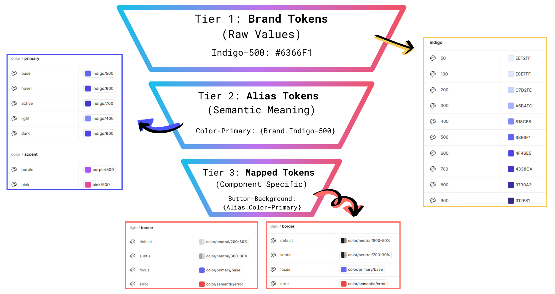
Change one brand token -> Update all instances across the system.
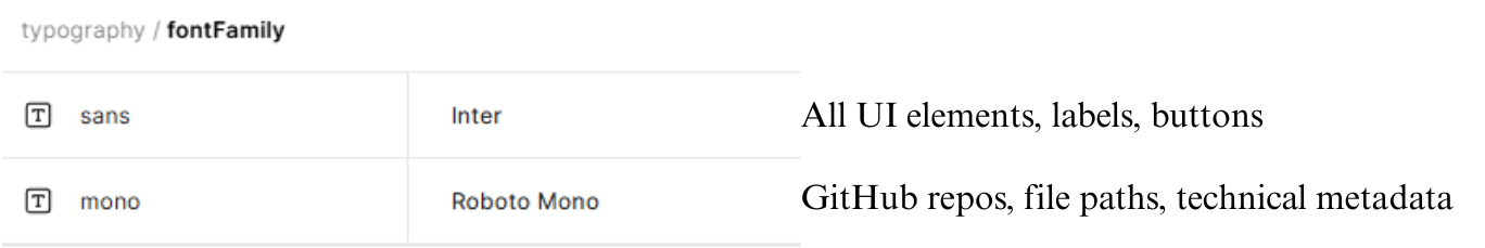
Why two fonts? Using monospace for technical data created instant visual distinction.
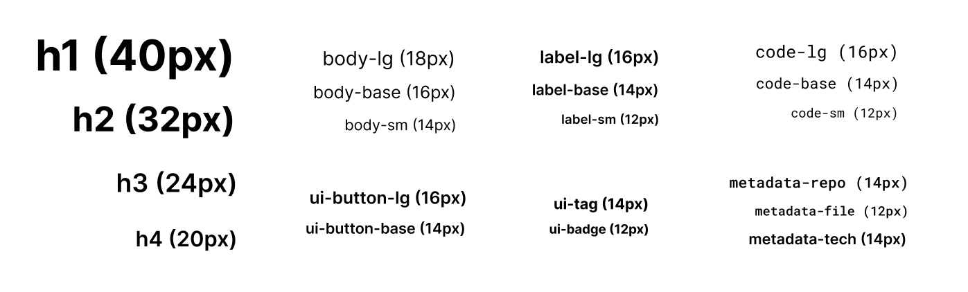
Typescale with font, size and weight.
Color System: Dark Mode First
Developers overwhelmingly prefer dark themes - the palette was designed for dark first.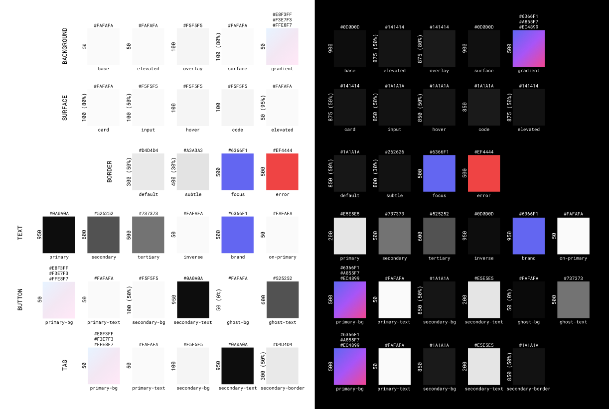
In both light and dark themes, high contrast was maintained for accessibility.
6. The Viewer and Streamer Experience
THE VIEWER 👀
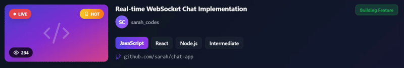
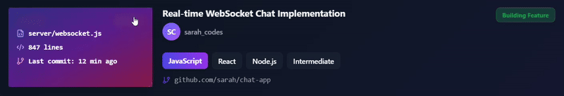
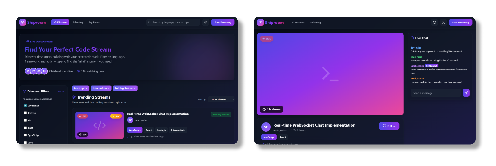
The Discovery Cards:Stream cards are the primary discovery mechanism. They need to answer 5 questions in 3 seconds:
- Is it live? -> Red pulsing badge, impossible to miss
- What language? -> Gradient language tag, always first
- What are they building? -> Title with 2-line truncation
- What's the tech stack? -> Framework + runtime tags
- What's happening right now? -> Activity badge with semantic color
The "Peek" Interaction:
Problem -> Users Wanted to know exactly what file the developer was editing without clicking.
Solution -> Hover over thumbnail -> Overlay appears showing:
This micro-interaction gives users the final 10% of context they need, without breaking their browsing flow.
Stackable Filters > Search Bars:
A search bar assumes users know exactly what they're looking for. But discovery is exploration Sidebar with three filter categories:
- Programming Language (JavaScript, Python, Go, Rust, TypeScript...)
- Skill Level (Beginner, Intermediate, Advanced)
- Activity Type (Building Feature, Bug Fixing, Code Review, Refactoring, Learning)
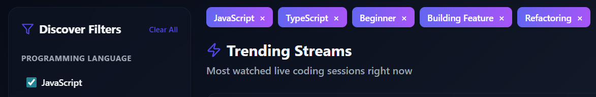
Users can combine requirements.
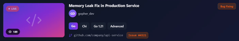
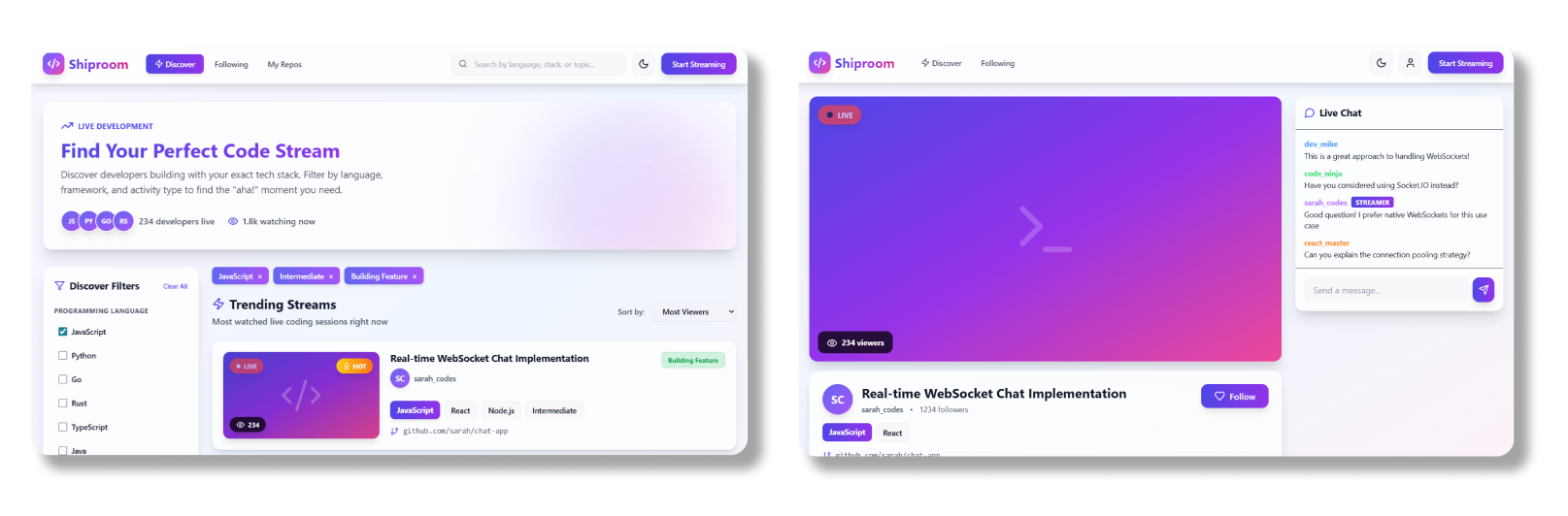
GitHub Integration (Contextual Awareness)
The Problem -> Developers wanted to know:
- What repo is the streamer working on?
- What file are they editing?
- What issue/PR are they working on?
The Solution -> Automatic GitHub integration that surfaces repo metadata:
If activity = "Bug Fixing":

            🐛 Issue #4521: Memory leak in cache manager

            github.com/company/api-service
If activity = "Building Feature":

            🌿 github.com/user/chat-app

            📄 Current file: server/websocket.js
If activity = "Code Review":

            👀 PR #892: Refactor authentication flow

            12 files changed, +347 −189
- Active repo and branch
- Current file in editor (via IDE plugin)
- Recent commits
- Open issues/PRs
THE STREAMER 📹
Stream View Layout: Once a user clicks into a stream...
Left Side (70%):- 16:9 video player
- Stream info section (title, tags, GitHub metadata)
- Live chat panel (384px fixed width)
- Always visible, no collapsing
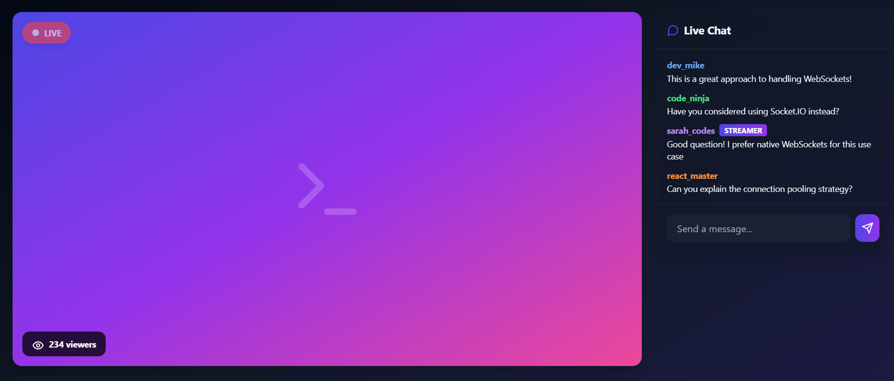
- Streamer badge (gradient highlight)
- Pinned questions (streamer can pin top Q's)
- Slow mode by default (5-second cooldown)
7. Visual Design
Brand Gradient: Indigo -> Purple -> PinkHas energy without sacrificing professionalism.
Glassmorphism + Depth
Cards use:
backdrop-filter: blur(20px)for glassmorphism- Layered shadows for depth
- Creates premium feel without visual clutter
Dark theme (default).
Light theme.
8. Technical Implementation & Engineering Handoff
Design System Tooling
Figma Variables:- 3 collections (Brand, Alias, Mapped)
- 847 tokens total
- Full dark/ligt mode support
- Built in Storybook for documentation
- Used Tailwind with custom config
- All components reference design tokens
Handoff Process
Documentation provided:- JSON token export
- React component props
- Usage guidelines
- Accessibility checklist
9. Impact & Outcomes
User Satisfaction:- NPS Score: +68(Promoters: 83%, Passives: 17%, Detractors: 0%)
Qualitative Feedback
What users loved:- ✅GitHub integration ("I know exactly what they're building")
- ✅Faceted filtering ("Niche topics in seconds")
- ✅The "Peek" interaction ("Quickly preview content")
- ✅Clean, systematic UI ("Easy to navigate and understand")
- 🔄Code snippet sharing
- 🔄Multi-stream view
- 🔄AI recommendations
10. Reflection & Next Steps
What Went Well
- Starting with Systems Thinking
- Building the design system first meant new features took minutes, not hours. The 'Compact Stream Card' took 10 minutes to create because all tokens existed.
- User Research Drove Every Decision
- The "Peek" interaction, GitHub integration, and faceted filtering all came directly from user pain points.
- Designing for Developers
- Understanding the audience meant I could make confident decisions.
What I'd Do Differently
- More Accessibility Testing
-
While I designed with accessibility in mind (4:5:1 contrast, focus states), I should have run WCAG audits at every stage, not just at the end.
- Mobile-First, Not Desktop-First
-
I designed for desktop and adapted to mobile but should have been the opposite. Mobile constraints force better prioritization.
The Bigger Learning
Design systems aren't just tools - they're strategic assets.
By investing upfront to build a scalable system, I was able to create a platform that can:- Launch new features in days
- Maintain consistency across 100+ screens
- Support 10 users and 10,000 users without redesigning
GitHub Repo: github.com/issoni/Shiproom-Design-System